The Overview is where you start every session. In seconds, you'll know if your ads are healthy, which segments are winning, and whether trends are moving in the right direction.
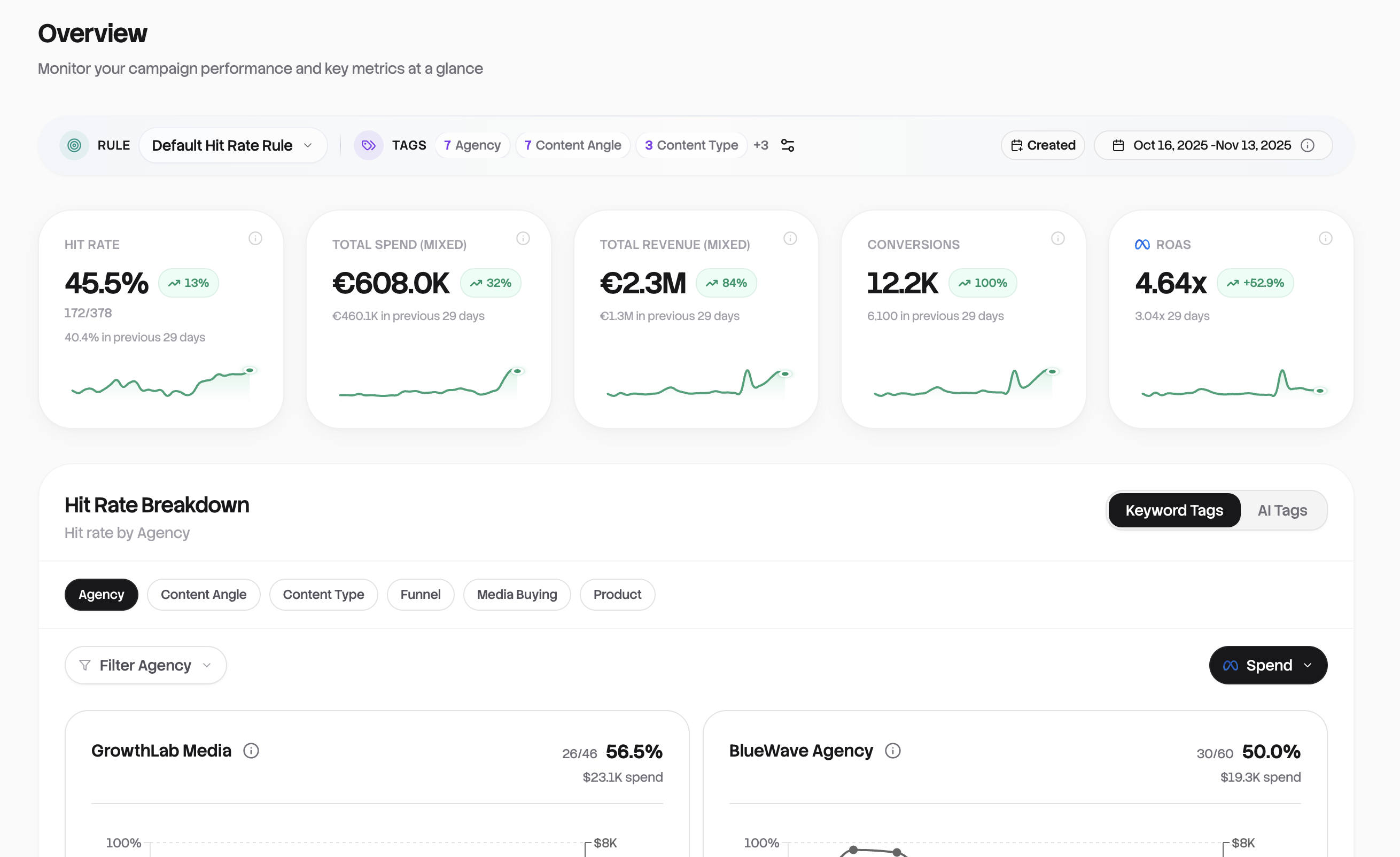
The Rules Summary Bar
At the top of your dashboard sits the Rules Summary Bar, your control center for context and filtering.
Here you'll see your active Hit Rate Rule (click to switch between rules), your configured Keyword Tags grouped by type, and a date range picker that defaults to the last 7 days. The rule you select determines what counts as a "hit" across your entire dashboard.
If you haven't set up rules yet, you'll see a prompt guiding you to create your first one.
Metric Cards
Five cards tell your performance story at a glance. Each shows the current value, a sparkline trend, and a period-over-period comparison (green means up, red means down).
Hit Rate is your most important metric: the percentage of ads meeting your success criteria. It displays as a percentage with a breakdown like "72% (83/115 hits)". Click it to jump straight to your misses sorted by spend.
Total Spend shows your ad investment for the selected period. If you have accounts in different currencies, it'll show "Mixed" to let you know.
Revenue shows total conversion value attributed to your ads. Conversions shows the raw count. Click either to jump to the Ads table sorted by that metric.
ROAS shows your return on ad spend as a ratio like "2.43x". Click the dropdown to switch between ROAS types: Meta ROAS by default, or Pixel ROAS, NC ROAS, and POAS variants if you have TripleWhale connected. Your selection is remembered for next time.
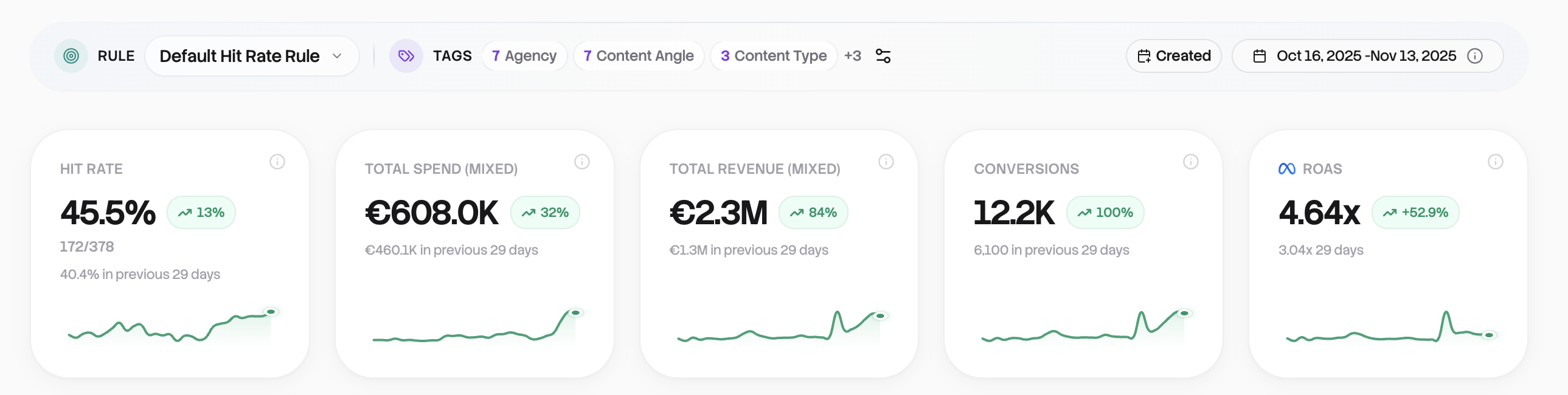
Hit Rate Breakdown
This is the heart of the Overview. It answers one question: which parts of my ad operation are actually performing?
How it works
Your keyword tag rules define categories for your ads, maybe by agency, product line, funnel stage, or creative format. The Hit Rate Breakdown shows performance for each category. Toggle between Keyword Tags (your rules) and AI Tags (automatically detected themes) using the switch in the top right.
Select which category to view using the pills. If you've tagged by both "Agency" and "Product," switch between them to see different cuts of your data. Use the filter to narrow down to specific values, like comparing just two agencies side by side.
Reading the cards
Each card shows the entity name, hit rate percentage, raw count (like "45/120 hits"), and a trend chart. The striped bars represent the previous period, solid bars the current period, so you can instantly see if things are improving or declining.
Use the metric selector to overlay spend, ROAS, revenue, or CPA on each card's chart. This helps you spot patterns like "high hit rate but low spend" (a winner you're under-investing in) or "low hit rate but high spend" (a budget drain to investigate).
Click any card to jump straight to the Ads table filtered to that segment.
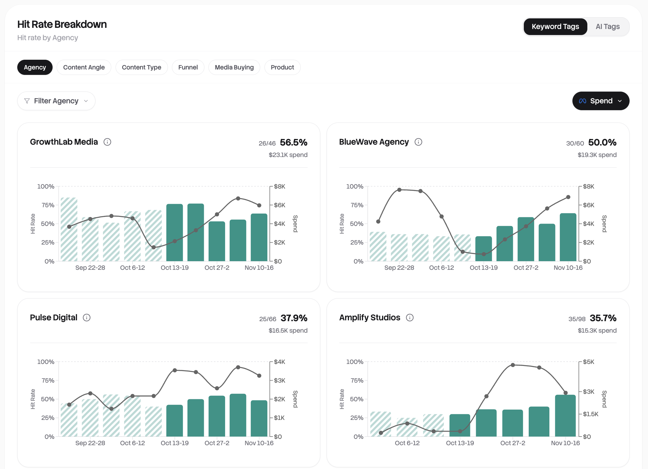
Performance Trend Chart
This chart visualizes your key metrics over time. Use it to spot patterns, identify anomalies, and track progress toward goals.
Click the metric pills to toggle visibility. You can show Spend, Revenue, and ROAS from Meta, plus Pixel ROAS, NC ROAS, POAS, and NC POAS if you have TripleWhale connected.
Set a ROAS target line to track performance against a goal. Options range from 1.0x to 5.0x. This makes it easy to see which days you hit your targets. Hover over any point to see exact values.
Keyword Tag Trends
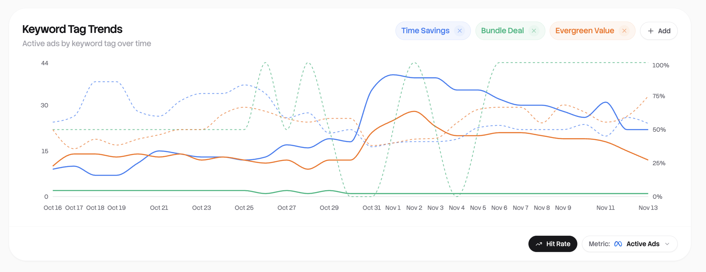
See how your tagged ad categories perform over time. This reveals which content themes are gaining or losing traction.
Add tags via the dropdown (organized by entity type) and select up to 10 simultaneously. Choose what to measure: New Ads (created per day), Active Ads (with activity), Spend, Revenue, or ROAS.
Toggle on the Hit Rate overlay to add a dashed line showing hit rate percentage. This is useful for correlating volume with quality. You might see high spend on a tag that's actually declining in hit rate.
Look for rising trends (tags gaining momentum), declining trends (themes losing effectiveness), and diverging lines where one tag is pulling ahead of others.
Putting it to work
Start your day here. Check the metric cards for overnight changes, scan the Hit Rate Breakdown for segments needing attention, and review trends for emerging patterns.
For weekly reviews, extend the date range to 14 or 30 days and compare entity performance across the longer period. Look for consistent winners and consistent underperformers.
Before making decisions, always click through to the Ads table for details. Check sample sizes, since small numbers can mislead, and compare current vs. previous period in the trend charts.
Everything updates automatically when your ad accounts sync, so you're always looking at fresh data. From here, dive deeper into any area: click cards, explore segments, or head to the full Ads table for granular control.