The Ads page gives you granular control over every ad from your connected accounts. Filter, sort, group, and drill down to find your top performers or budget drains.
Filtering Your Ads
The filter bar at the top controls everything you see. Every change updates the table instantly.
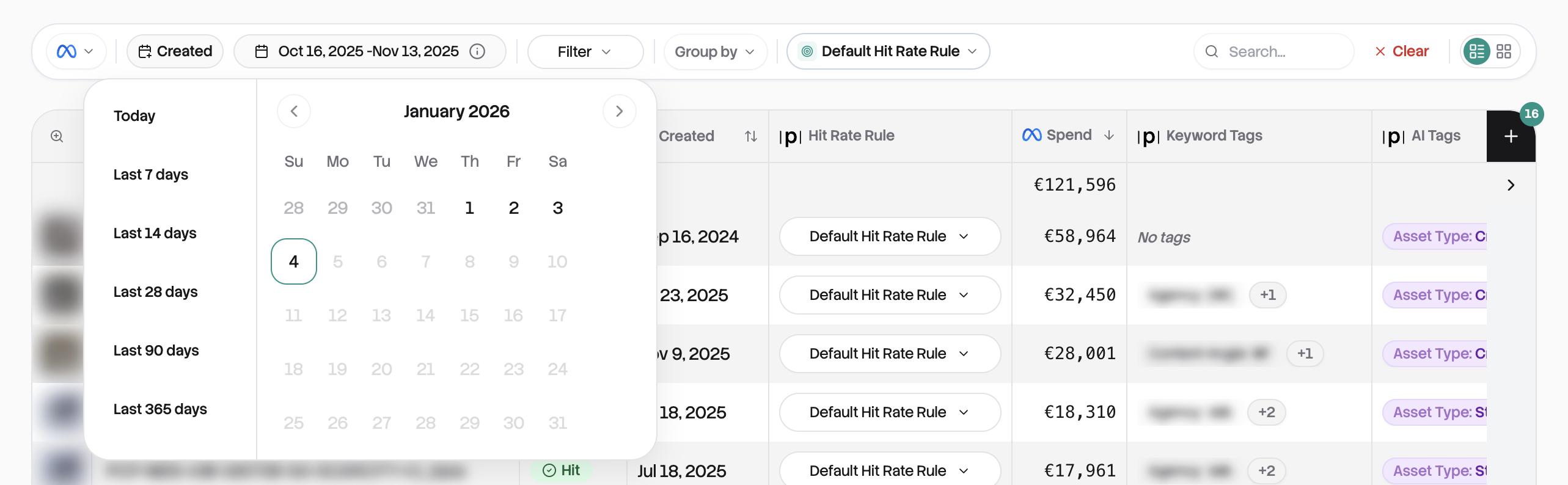
Date range and platform
Start by setting your date range. Last 28 days by default, but you can select any period. If you have multiple platforms connected, switch between them with the platform toggle.
The filter panel
Click the filter icon to open your filtering options. You can narrow down by Status (hits vs. misses), Format (video, image, carousel), Ad Account, Keyword Tags, Country, or AI Tags. Select multiple values in each filter, and they'll appear as chips you can click to remove.
Search and rule selection
Type in the search bar to find ads by name. It searches across everything and updates as you type. You can also switch which Hit Rate Rule is evaluating your ads. Changing the rule re-evaluates everything instantly.
When you have active filters, a "Clear All" button appears to reset everything to defaults.
Table View
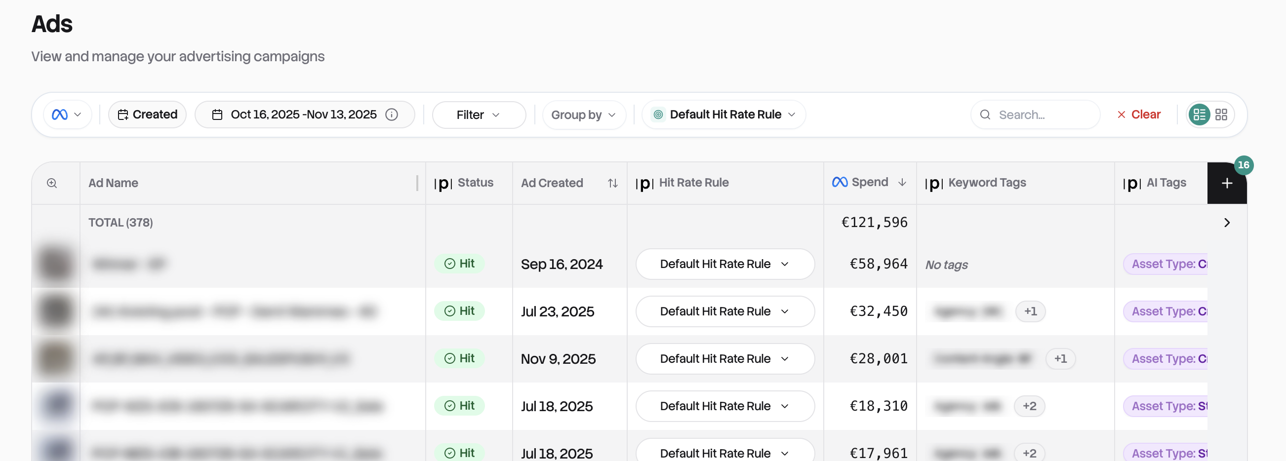
The table view is your default and most powerful tool for analysis. Each row is one ad, showing a thumbnail preview on the left, hit status (green checkmark or red X), the ad name, and all your selected metrics.
Sorting your data
Click any column header to sort. First click sorts descending (highest first), second click sorts ascending, third click removes the sort. For multi-column sorting, hold Shift and click additional columns. By default, your biggest spenders appear first.
The summary row
At the top, a summary row shows totals across all visible ads: hit rate as a fraction (like "45/120"), sums for spend and conversions, and averages for metrics like ROAS and CTR. This updates automatically as you filter.
Navigating large datasets
For performance, large datasets are paginated. Choose to see 25, 50, 100, or 200 ads per page using the dropdown. The table can be wider than your screen. Scroll horizontally to see all columns, while the preview and name columns stay fixed.
Card View
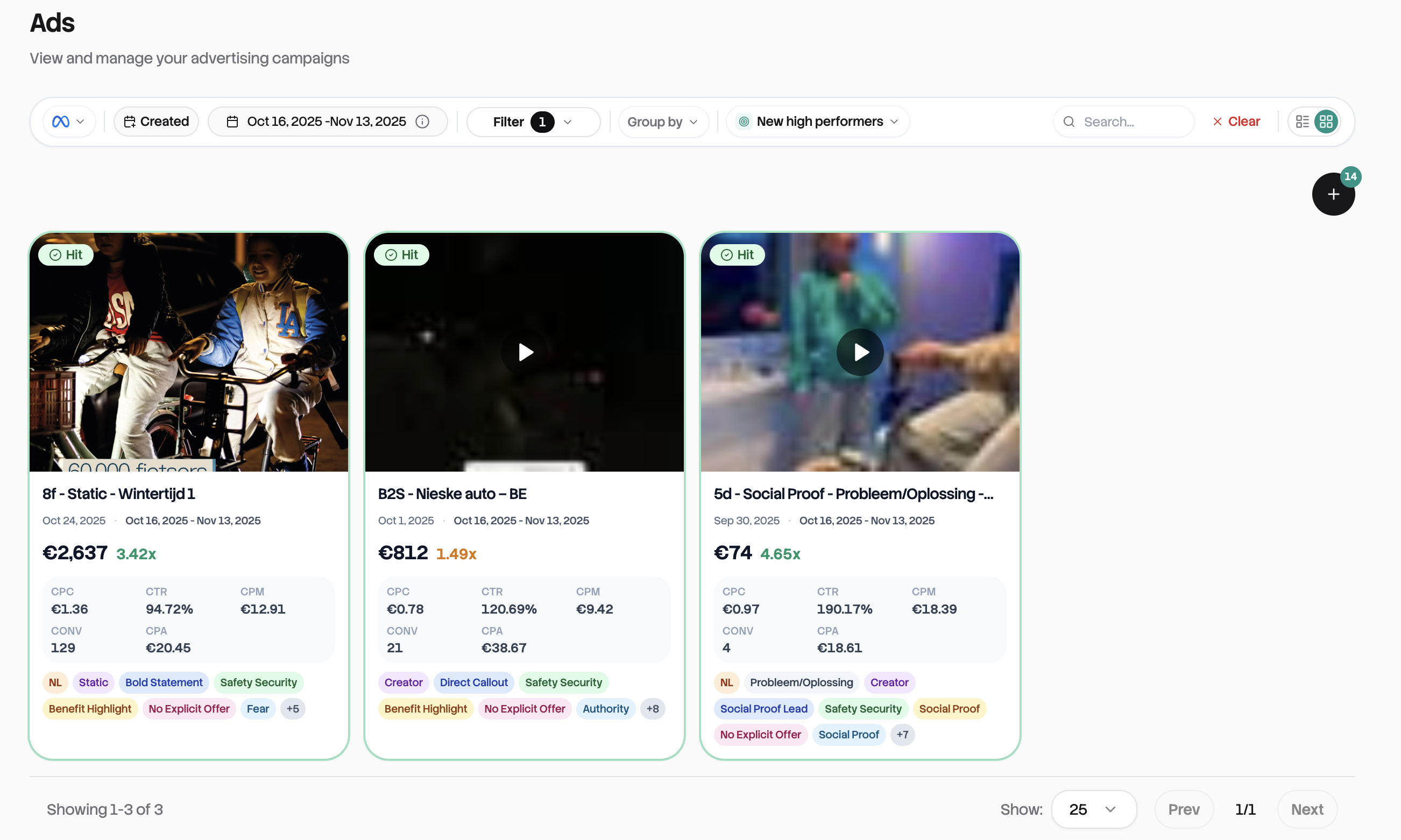
For visual browsing, switch to Card view using the toggle in the top right. Each card shows a large media preview, the ad name, key metrics (Spend and ROAS are always shown), hit status, and any tags.
Cards arrange responsively: 1 column on mobile, 2 on tablet, 4 on desktop. Click the settings icon to choose which additional metrics appear on cards. You can add up to 9 beyond the default Spend and ROAS.
Note: Card view isn't available when grouping is active. For grouped data, you'll use the table.
Grouping for Insights
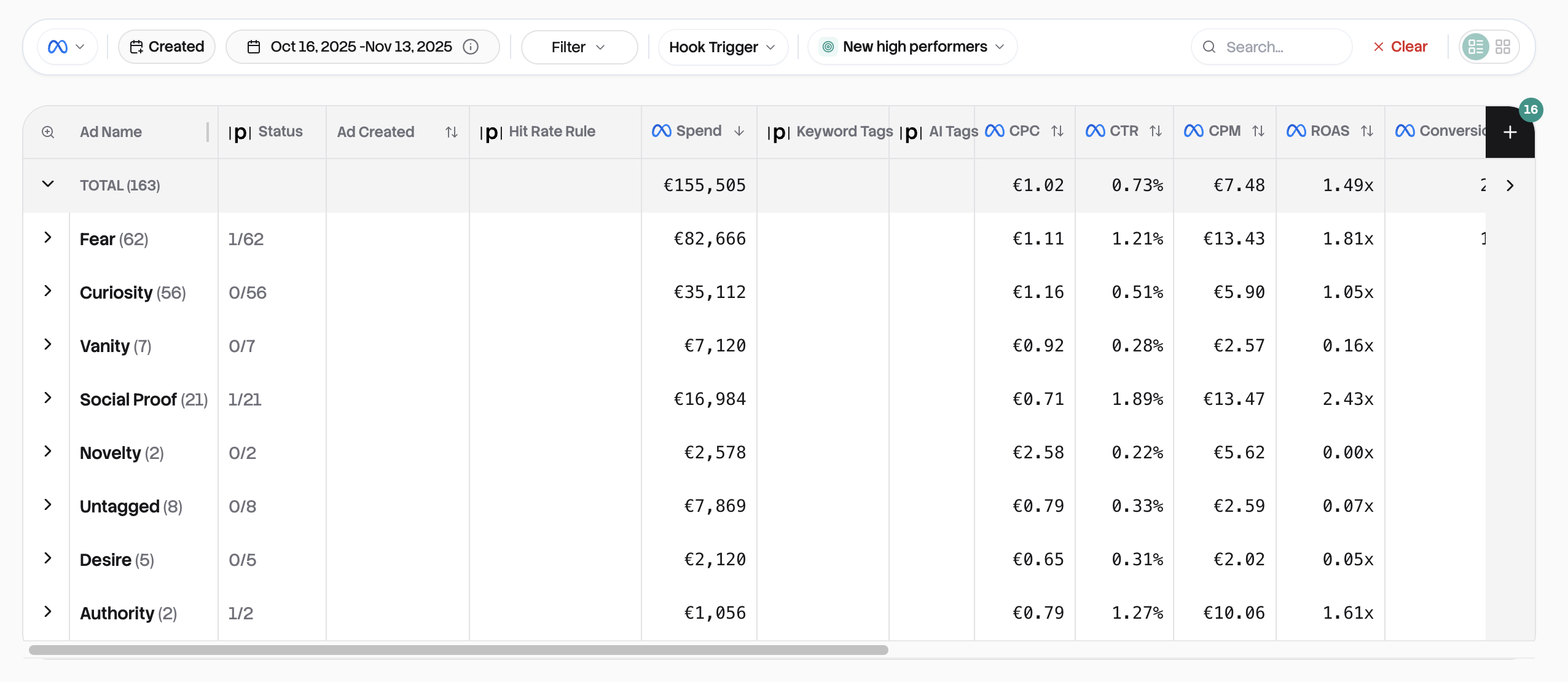
Grouping rolls up your ads into categories so you can see aggregated performance at a glance.
How it works
Select a grouping option from the dropdown: Ad Account, Country, Campaign, Keyword Tag, or AI Tags. The table collapses into group rows, each showing the group name, ad count, hit rate, and aggregated metrics.
Click any group row to expand it and see the individual ads inside. Click again to collapse. Group summary rows calculate sums for spend-type metrics and averages for rate-type metrics like ROAS and CTR.
This is how you quickly answer questions like "which campaign is winning?" or "how do my video ads compare to static?"
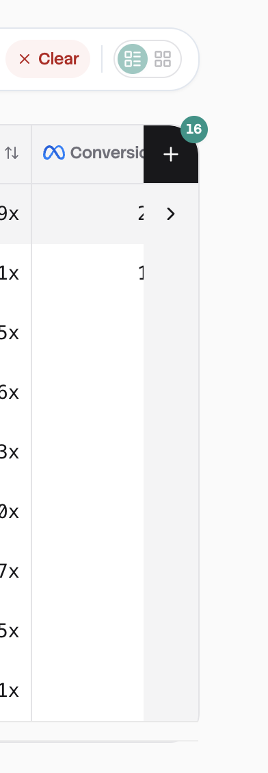
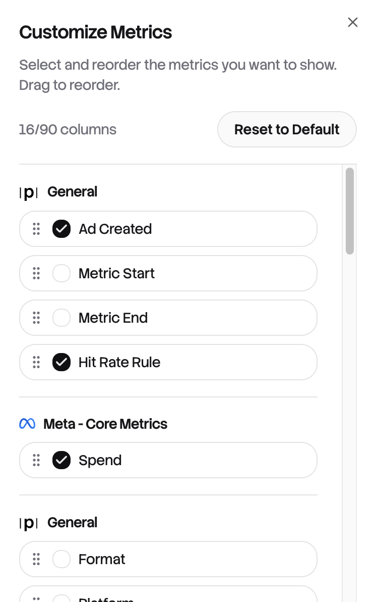
Customizing Columns
Click the "Columns" button to control which metrics appear in your table. You'll see checkboxes organized by category: General Info, Meta Core Metrics, and TripleWhale Metrics (if connected).
You can display up to 9 metric columns at once (plus the fixed preview and name columns). Drag handles let you reorder columns however you like. Your selections save automatically to your browser and persist in the URL.
 →
→
Common Workflows
Finding underperformers: Filter by Status "Miss", sort by Spend descending. Your biggest-spending misses appear at the top. Click to expand and see what's going wrong with the creative.
Comparing campaigns: Group by Campaign, sort by ROAS. See which campaigns have the best hit rates at a glance, then expand top performers to find the winning ads.
Quick creative review: Switch to Card view, set page size to 100, and scroll through previews visually. Click any card to see the full creative.
Putting it all together
The Ads table is where high-level insights become specific actions. Start with your Overview to spot trends, then come here to dig in. Filter to find problems, sort to prioritize, group to compare categories, and click through to understand exactly what's working and what isn't.